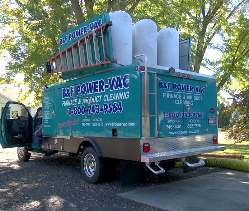
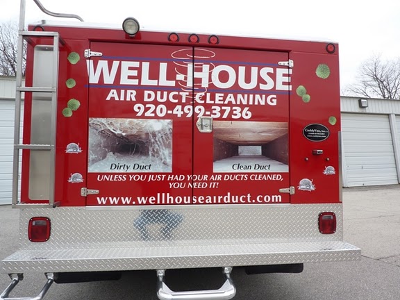
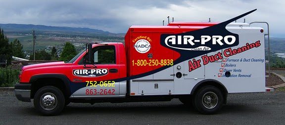
 Having the right equipment is critical for doing the job. Having the right branding is a critical part of getting the job in the first place.
When planning the signage for your next American Caddy Vac, remember to think in terms of the person who will be seeing your rig. The vast majority of people who see your truck are other drivers as you move from one location to another. Most of these drivers will only see your truck for a few seconds. If you design your signage like a magazine add with lots of small text, most people will never read it. To make an impression on drivers, design your signage more like a billboard. Critical information must be large, easy to read, and easy to remember.
For the largest surfaces on your Caddy Vac, be sure to have in large, bold, easy-to-read type, these three critically important pieces of information:
 The name of your business (and logo). Be sure your name and logo are front and center. Use a bold, easy-to-read font. Typically, a script style of font is more difficult to read. When there are only a few seconds available, drivers simply ignore difficult to read text. Your logo should be easily recognizable as well. Designers sometimes develop very creative logos that are too complex. If a driver can’t make out the meaning of a logo quickly they will ignore it.
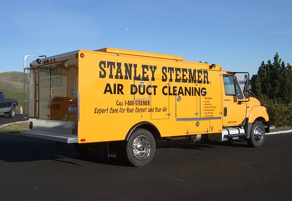 Contact information. Yes, people can look you up, but that is another step. Hopefully you have a short, easily remembered URL for your web site. Keep it short. There is no need to add “www.” in your signage. If your web site is “cleanairtulsa.com”, then make it easier to read and remember by capitalizing each of the words represented, “CleanAirTulsa.com”. URLs are not case sensitive so customers will find you either way. Phone numbers are great, especially if yours spells out a word that people can remember, such as 1-800-CLEAN AIR”. If you don’t have that benefit it is still fine to put your number on the truck, but don’t expect that a driver will be able to grab it while they are driving.
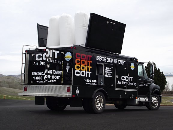 Each of these three pieces of information should be bold and large on all three flat surfaces of your Caddy Vac. The text should contrast significantly from the background color to make it stand out. White on darker colors and black on lighter colors works great. Other combinations can work well too. Keep the concept of contrast front and center.
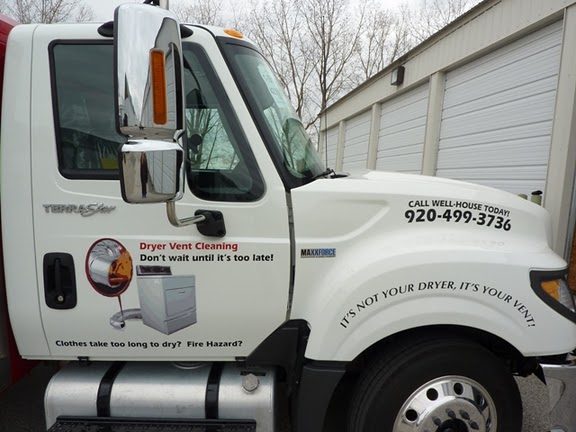 But what about the other surfaces of the truck where there isn’t room for large, bold, messaging? These areas are ideal for additional messaging for drivers who may have more time to read (for instance, sitting at a traffic signal), or for neighbors and passersby who may see the truck while it is at a job site. Use that space! Tell more about your business. Having said that, it is very important to not put so much information on the side of your Caddy Vac that it becomes cluttered. People just look the other way when they are confronted with too much information. Simple messaging is the best messaging.
The key in this whole process is planning. Don’t let branding be an afterthought. You have a large advertising platform you are driving around town every day. Make the most of it!

